This got me thinking and i feel that wearable tech - techno jewellery and interactive retail strongly relates to my project due to my context being fashion and the use of thermochromic and hydrochromic dyes creates an interactive material with the consumer and therefore reflects this within retail as they shop it. I am going to include this finding along with my research within my presentation on technology and how it is pushing forward all of the time. Although my work directly links in well with wearable tech and interative retail it could find a place else where with projected publicity how the graphics within the advertisement is the main focus for it, within my work the use of smart dyes is probably my main focus. Also discrete consumerism could be an avenue i could choose to place my work due to the idea of words being hidden until touched...
Monday, 30 April 2012
30.04.2012 Elaine Philpot Contextual Studies.
Today's seminar was all about exploring lifestyle trend influences which i found really interesting due to my project being about the future, the trends i feel were a prediction for the future and it made sense! It was all about being able to target an audience and appeal to the consumers out there today. We watched a video from trend hunter about the top 20 lifestyle trend influences.
Thursday, 26 April 2012
More Photoshop..
Yesterday i played around with photoshop and
after i had blogged i had continued to do some more as they becamemore routinal
and easier to do ! I played around with colour to create different moods and
added in a swan to relate it back to my theme!


The left image
isn't that realistic and i find that the composition is quite block like as it
is too distincive where the images meet. I wanted the effectof movement where it
eased and subtly changed appearance. However i do like the use of different
postures here..
In the right hand
image i overlayed the same image and used subtract where it gave an eary feeling
towards it, almost mythical which i think links nicely in with the story of swan
lake.


The left hand image
is one of my favourites where i have explored the use of movement through 3
images and drifted the images from the back left and brought forward to the
right, so within composition and posture i feel as if i have achieved
movement.
The right hand
image is interesting as the main image is central and to the left the scale of
her has changed and the swan sits subtly on here dress. I tried to blend it in
with the white as if she is becoming the swan again linking it back to the story
of swan lake.


The left hand image
here is interesting in colour as it is much darker than the rest. This takes me
back to the way black swan costumes were presented in the new york gallery where
i wouldn't have to explain what this is but by the colour of it you can tell
that it has darkened, in particular by the way the personna isn't facing us
anymore....
The right hand
image is much lighter in colour and in posture. I like the way the overlayed
imaged cups the background image linking the two together.
Using photoshop has
opened my eyes up to the possibilities of overlapping work to create something
either illusional, story telling, or to provoke feelings. I feel as if it could
be quite a powerful tool for the future! (Links in with the technology
theme,also!)
Learning Photoshop
I haven't got much work done this morning that's because
i have been learning photoshop skills. My eyes are hurting!! I have Photoshop
cs5 and it is quite easy to use once you know what you're doing (which obviously
takes alot of time!). From looking at swan postures and taking photos of my
little sister and exploring movement i wanted to combine these photos so that
they did express movement! I am quite happy with the results so far and am going
to keep going today exploring the different technqiues you can create...
.jpg)


.jpg)
Using linear light
onto 2 images merged together. The light is really warm, and enhances all of the
darker areas. My favourite area is where the arm cups the head it joins the two
images together in shape as well as photoshops technique!

This was my first
go at merging photos together, i left the light properties as normal so it
looked soft so it was a subtle merge so you could clearly see
movement.

This was a
development from previous as i added in another layer and merged them all
together and changed the light onto it too a soft light

I quite like this
one, this is a further development into looking into black and white,positive
and negatives and seems these poses were inspired by swans i thought that i
could combine the two together using exlusion to seperate the two in colour but
merged in pose.

I used linear light
here to really enhance the colours, i love the way the colours look dip dyed on
the dress this was probably the main reason why i had done it! The pattern of
the flooring also comes through which i could push to create patterns.

This was a follow
up to the previous merge of 3 photos, although 2 of the layers use different
sorts of lighting of soft and hard light to enhance one another whilst still
keeping it subtle. I also like the playfulness with scale
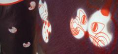
Chalayan.

Chalayan's unique style has been copied by others, here Lady Gaga wears a copy of the original made by another designer!!! Chalayans was first shown on the runway in 2007...
Chalayan is now known as "a true now-ist (more than a modernist). He is excited by science, fascinated by world politics, and recognizes the fact that the way we dress is a reaction to the times we live in. Since 9/11, fashion's response to reality has been to hide in the past. Now that mood is lifting, and Chalayan, like Nicolas Ghesquière, is right to be bringing us face to face with something that is, too sloppily, being dubbed "futurism."
This is a new designer who is looking into similiar (and probably more in depth) concepts that i am, he is looking more into the materials we use whereas i am looking into the use of smart dyes! Here are some more examples of his work that i fins inspirational....


"This was fashion addressing the subject of
fashion, a dissection of our contemporary habit of recycling "vintage," and an
embrace of high technology, all at the same time."
I really like the geometric shapes created here
and i think i may have ago at exploring geometric patterns rather than organic
ones all of the time. I need to change a little just to explore what can be done
in different ways!!
Plastic Fantastic!
As i am starting to look further into plastics to relate with my chosen concept
of smart dyes... I thought it was time i looked into plastic related research
staring with fashion as i think my context for my work will be fashion/accessory
based as i was looking into perhaps umbrella fabric ? And after looking into
Christian Dior 2010 Fall Collection; it's plastic headwear was perfect
inspiration.


I like how the plastic has elongated the model
and has been shaped around the head according to the hair. I particularly like
the right image due to the idea of black and white with a contrasting ice blue
on her face, it adds a slight accent colour but refreshes the tones and shades
in the dress!
I love the left image, how there is a mass of
feathers around the models neck and uses the fabric to drape down the body and
volumnising towards the knee, although the shape is oversized, it is still
balanced accroding to her. I also love the use of yellow!It's contrasting and
completley changes how you see this electric blue, the lilac coloured heels
cools the brightness down.
I couldn't decide which images i liked best, i
did choose 8 out of possibly more as i prefered the colours to the others but
Dior has used plastic in a completley different way to the norm,and has changed
it's practicality and it's purpose. I like how it been shaped around the models
heads, usually in a contrasting colour!
Wednesday, 25 April 2012
Photoshop
I have Photoshop cs5 and it is quite easy to use once you know what you're doing
(which obviously takes alot of time!). From looking at swan postures and taking
photos of my little sister and exploring movement i wanted to combine these
photos so that they did express movement! I am quite happy with the results so
far and am going to keep going today exploring the different technqiues you can
create...
.jpg)


Using linear light
onto 2 images merged together. The light is really warm, and enhances all of the
darker areas. My favourite area is where the arm cups the head it joins the two
images together in shape as well as photoshops technique!
This was my first
go at merging photos together, i left the light properties as normal so it
looked soft so it was a subtle merge so you could clearly see
movement.
This was a
development from previous as i added in another layer and merged them all
together and changed the light onto it too a soft light.
I quite like this
one, this is a further development into looking into black and white,positive
and negatives and seems these poses were inspired by swans i thought that i
could combine the two together using exlusion to seperate the two in colour but
merged in pose.
I used linear light
here to really enhance the colours, i love the way the colours look dip dyed on
the dress this was probably the main reason why i had done it! The pattern of
the flooring also comes through which i could push to create patterns.
This was a follow
up to the previous merge of 3 photos, although 2 of the layers use different
sorts of lighting of soft and hard light to enhance one another whilst still
keeping it subtle. I also like the playfulness with scale
Wednesday, 18 April 2012
flamingo inspired knitting
Today i tried to be productive with my work and wanted to crack on with work on the knitting machine; but i caught my jumper in, bent a few needles and it kept getting jammed. So, i stopped with what i had as i thought if i carry on i will not work to the best of my ability...
I made a lot of little circles hoping to make a fabric with them by overlapping them and layering them up with smaller ones; but as i was knitting them it naturally began to twist and curl and i thought this was a lovely example of feathery textures. So i hand sew each one individually to one another to get them to twist all together in a long strip. My aim is to make more of them to make a finished piece out of them as i only managed to do 2 strips....


I made a lot of little circles hoping to make a fabric with them by overlapping them and layering them up with smaller ones; but as i was knitting them it naturally began to twist and curl and i thought this was a lovely example of feathery textures. So i hand sew each one individually to one another to get them to twist all together in a long strip. My aim is to make more of them to make a finished piece out of them as i only managed to do 2 strips....


It's not designed to be a headband but i thought it looked quite good as a hair accessory, its different!


It looks good and sweet i think. The knit makes it quite home traditional; the colours are very much inspired by flamingos
Humans as Birds...
As part of my project so far i have mainly focused on birds such as swans and flamingos but looking further into the way they behave i realised they share the same qualities humans. I got my little sister to kindly model for me to interpret the way they move and behave. I photographed her in a white dress and black leggings to highlight the idea of black and white from the influence of swan lake and the black swan....


This is my favourite image i think,i love the natural light that comes in, and she looks lovely and elegant especially with the drapery of the fabric.


Some of the postures i have re-created here, are taken from ballet poses.


I took this image from a different angle to get another take on what she is doing, i like the high angle as her arms become the main focus.

I am hopefully going to create some drawings from these images to personify and focus on the posture. Hopefully combine humans with birds to intertwine the two objects together maybe through stitch?! I have connected and mentally linked birds feathers with humans clothes and the way they move link with humans. This could get more in depth to come....
Jess x
Tuesday, 17 April 2012
From Idea to Outcome.
As part of Les' pdp session he opened my eyes to the was people explore and conjure up ideas.
-senses:
-sight - how we all see things differently, see patterns and shapes we wouldn't normally see at first glance
-hearing- a piece may have a sound depending on the materials used.
-taste- in some cases, you can change a materials taste to make it interactive.
-smell- depending on what dyes, materials,processes you use you can change a textiles smell. This could work in favour of your aim or could conflict with it.
-touch- this is probably the idea that i find most interesting due to the direct interaction with the piece. I know when i look at someones work i just want too touch it!
For my project i would like to be able to use these as a source of interation, and therefore incorporating them into my work.
I have had a good think about what Les was saying about your work has to have a purpose, and to explore into the context of my work.
what do you want from the work?
what do you want an audience to do with your work?
Asking myself these questions will help me to portray my work in a better context.
After this we had to then analyse each others work to help progress forward..
I'm going to look at uses of
Colour-
Swan-white, oranges, blacks.
Flamingos-pinks and oranges
Ducks-greens, blues, browns
Scale-Work with a larger or smaller scale that i can repeat with alot of detail or blow up with a lot less detail.
Shapes- look into surfaces and feathers.
Contrasts- Black swan vs. Swan lake. Black and White.
I need to have an active mind.
We experience things:-senses:
-sight - how we all see things differently, see patterns and shapes we wouldn't normally see at first glance
-hearing- a piece may have a sound depending on the materials used.
-taste- in some cases, you can change a materials taste to make it interactive.
-smell- depending on what dyes, materials,processes you use you can change a textiles smell. This could work in favour of your aim or could conflict with it.
-touch- this is probably the idea that i find most interesting due to the direct interaction with the piece. I know when i look at someones work i just want too touch it!
For my project i would like to be able to use these as a source of interation, and therefore incorporating them into my work.
I have had a good think about what Les was saying about your work has to have a purpose, and to explore into the context of my work.
what do you want from the work?
what do you want an audience to do with your work?
Asking myself these questions will help me to portray my work in a better context.
After this we had to then analyse each others work to help progress forward..
I'm going to look at uses of
Colour-
Swan-white, oranges, blacks.
Flamingos-pinks and oranges
Ducks-greens, blues, browns
Scale-Work with a larger or smaller scale that i can repeat with alot of detail or blow up with a lot less detail.
Shapes- look into surfaces and feathers.
Contrasts- Black swan vs. Swan lake. Black and White.
Elaine Contextual Studies. Monday 16.04.2012
Yesterday at uni was really insightful to me as Elaine presented a presentation on how we see one anothers work and how we want others to percieve it. She gave the idea and the example of the exhibition at the contemporary art gallery in New York. This i thought was particularly interesting due to me exploring the idea of the performance beforehand.
The dresses were all photographed in different ways to create a performance within itself. You see the photos unravel from bright exposures and then has been edited to show the negative side of it.


To the eye without watching the film, the photos emote a certain kind of feeling and language to the viewer. It starts off light and innocence and darkens as the photo and the way its photographed does aswell.
The point in showing us this was a great example and an eye opener to how i should be thinking when it comes to presenting my work. AND it also tells me that i can be as experimental as possible when presenting my work! Does it have a narrative? Tell a story? Should it be presented digitally?
These are questions i should ask my self to fit into the context of the work....
The second part to her seminar was explaining the presentation we need to present about our own work. My work is fitted around the issue of 'technology' so i now need to explore and research:
-market research
-trend analyses
-investigation into materials
-production methods
-engagement with key issues currently facing the textile industry


The dresses were all photographed in different ways to create a performance within itself. You see the photos unravel from bright exposures and then has been edited to show the negative side of it.
To the eye without watching the film, the photos emote a certain kind of feeling and language to the viewer. It starts off light and innocence and darkens as the photo and the way its photographed does aswell.
The point in showing us this was a great example and an eye opener to how i should be thinking when it comes to presenting my work. AND it also tells me that i can be as experimental as possible when presenting my work! Does it have a narrative? Tell a story? Should it be presented digitally?
These are questions i should ask my self to fit into the context of the work....
The second part to her seminar was explaining the presentation we need to present about our own work. My work is fitted around the issue of 'technology' so i now need to explore and research:
-market research
-trend analyses
-investigation into materials
-production methods
-engagement with key issues currently facing the textile industry
I found a good and resourceful book yesterday in the library that i am curently in the process of reading.
'smart materials inarchitecture and design' by axel ritter.
'smart materials inarchitecture and design' by axel ritter.
These are some images i found interesting and well suited for my presentation:

Lobby of the Copenhagen Opera house with three chandeliers. The glass surfaces are covered with dichroitic filters.

The appearing pattern wallpaper, Sweden, 2005.
The wallpapers purpose was to demonstrate to the viewer that simple everyday objectscan change over time under the influence of forms of energy. It uses UV sensitive inks soit changes when exposed to light.

'filigree wallpaper', Great Britain 2004.
The wallpaper takes its biggest influence from William Morris, using paint made up of water, egg white, icing sugar and phosphorescent pigments. The egg whites didnt add an moisturisation properties and the wallpaper became extremly sensitive so would only be practical for interiors.
Upon looking through the book i found a projectbeing worked on called 'skirteleon' that can change colour and pattern depending on the activities and the mood of the person.
It is part of the 'transfer me' collection for the nemo science museum in 2004 which was created to show the idea of playfulness and textilesand interaction can occue with the use of technology.
Upon researching further into the skirt i found this website which i think is going to be a big help for my presentation as it is a company that works with textiles technology.
Subscribe to:
Posts (Atom)